
Introduction
This webpage provides additional resources, links and content for the 2017 All TEC Day keynote – CEO Decision Making with Data. I appreciate that you’ve come here to learn more - if anything isn’t clear you can send me an email directly andrew@drandrewpratley.com
There are two types of resources on this page. Firstly, there is additional information on most of the topics I covered in the presentation (except for the case studies). This is usually in the form of a text based summary with external links to the original sources for you to see where this information came from.
Secondly there is content which I’ve written and videoed to expand on the concepts of either (i) research that has been conducted or (ii) developing questions and applying statistics to these questions. There’s over an hour of video content on this page. It will stay live at this address until such time as the internet stops.
Slide deck
Click below to find a PDF of the slide deck used for CEO Decision Making with Data.
UPS and Orion algorithm
As a logistics company, UPS’ business is a series of optimisation problems. In the 21st century tracking systems improved to the point where UPS decided to take a closer look at how trucks performed when delivering packages (Mayyasi, 2014). As a side note the first commercial in-car GPS was released by Garmin in 1998 with its Streetpilot model, which had a black and white display and no voice prompts.
With the increase of data through tracking systems, in 2001 UPS began to develop route optimisation software. The purpose of this software was simple, get drivers to locations faster, which means the delivery time decreases and the efficiency increases. Anecdotal evidence suggests UPS engineers had heard from the drivers that they spend a lot of time waiting at light to turn left. This was mostly likely one of many ideas tested.
The program of route optimisation morphed into a piece of software called Orion. Orion uses big data from UPS’ tracking systems to analyse 250 million address points a day and perform 30,000 route optimisations per minute (UPS, n.d.). To do this the algorithm is over 1,000 pages long.
By using right turn as the default decision, UPS states that they save $300-400 million annually in fuel costs (UPS, n.d.). Turning right allows UPS to use 10 million gallons less fuel and emit 20,000 tonnes less carbon dioxide. Most people believe that these savings come at the price of taking longer to deliver packages (because they drive further, usually not the most direct route). UPS now delivers 350,000 more packages each year while using 1,100 less trucks and travelling 28.5 million miles less (Kendall, 2017).
UPS engineers do still turn left to minimise delivery time about 10% of the time ((Kendall, 2017). UPS uses Orion’s route optimisation algorithm to determine when this should be the case. Drivers turn left in residential neighbourhoods without much incoming traffic, or where a right turn would take a driver too far out of the way (Berman, 2017; Prisco, 2017).
Turning right works for UPS because turning against traffic results in long waits in left hand turn lanes that waste time and fuel. Turning against traffic also leads to a disproportionate number of accidents. The National Highway Traffic Safety Administration has reported that turning left is one of the leading "critical pre-crash events". Left turns are a pre-crash event in 22.2 percent of crashes, yet right turns are a pre-crash event in only 1.2 percent (Choi, 2010). The NHTSA also reports that 61 percent of crashes that occur while turning or crossing an intersection involve left turns, as opposed to just 3.1 percent involving right turns. In short, turning left leads to over 10 times as many crashes. Avoiding those crashes saves UPS time and money.
Berman, R. (2017). The Science Behind Why UPS Trucks Avoid Making Left Turns. Retrieved March 12, 2017, from http://bigthink.com/robby-berman/the-science-behind-why-ups-trucks-avoid-making-left-turns
References
Choi, E. H. (2010). Crash factors in intersection-related crashes: An on-scene perspective (No. HS-811 366). WebsiteKendall, G. (2017). Why UPS drivers don't turn left and you probably shouldn't either. Retrieved February 22, 2017, Website
Mayyasi, A. (2014, April 4). Why UPS Trucks Don't Turn Left. Retrieved February 22, 2017, Website
Prisco, J. (2017). Why UPS trucks never turn left. Retrieved February 22, 2017, Website UPS. (n.d.). UPS ORION: The Driver Helper (Infographic) [Press release]. Retrieved February 22, 2017, Website
References
Choi, E. H. (2010). Crash factors in intersection-related crashes: An on-scene perspective (No. HS-811 366). Website
Kendall, G. (2017). Why UPS drivers don't turn left and you probably shouldn't either. Retrieved February 22, 2017, Website
Mayyasi, A. (2014, April 4). Why UPS Trucks Don't Turn Left. Retrieved February 22, 2017, Website
Prisco, J. (2017). Why UPS trucks never turn left. Retrieved February 22, 2017, Website
UPS. (n.d.). UPS ORION: The Driver Helper (Infographic) [Press release]. Retrieved February 22, 2017, Website
Flossing - is it worth it?
Whilst dental hygiene seems to be a fairly recent concept, dental floss was first commercially produced in 1882 (Kruszelnicki, 2001). Flossing has become a semi-regular part of the daily route for over a 100 million people recommended by one of the most trusted professions – dentists. Dentists know that plaque leads to cavities and forms around the teeth and the gums. Regular cleaning of the teeth and gums by tooth brushing and flossing should control or reduce plaque to an acceptable level for most people. Flossing is a $2 billion a year industry globally (Rosenthal, 2016).
In the past decade scientists have begun to review and test the effectiveness of flossing. They have found limited support for flossing. From peer reviewed journals the following quotes have been extracted:
- “The majority of available studies fail to demonstrate that flossing is generally effective in plaque removal" (Sälzer et al., 2015)
- “In light of the results of this comprehensive literature search and critical analysis, it is concluded that a routine instruction to use floss is not supported by scientific evidence” (Berchier, Slot, Haps, & Van der Weijden, 2008).
- “Self-flossing has failed to show an effect" (Hujoel, Cunha-Cruz, Banting, & Loesche, 2006).
- “There is some evidence from twelve studies that flossing in addition to toothbrushing reduces gingivitis compared to toothbrushing alone. There is weak, very unreliable evidence from 10 studies that flossing plus toothbrushing may be associated with a small reduction in plaque at 1 and 3 months. No studies reported the effectiveness of flossing plus toothbrushing for preventing dental caries" (Sambunjak et al., 2011).
- “Flossing cannot be recommended other than for sites of gingival and periodontal health, where inter-dental brushes (IDBs) will not pass through the interproximal area without trauma. Otherwise, IDBs are the device of choice for interproximal plaque removal” (Chapple et al., 2015).
Despite these findings, dentists and dental associations continue to recommend that patients floss (Harvard Health, 2017). Dr. Tim Iafolla, a dentist and public health analyst at the National Institutes of Health's National Institute of Dental and Craniofacial Research has said:
“Weak evidence for flossing doesn’t necessarily mean that flossing is ineffective, it just means there isn't positive evidence for flossing. Flossing is a low-risk and low-cost procedure... [so] we just don’t have much hesitation to say go ahead and do it. It's not going to hurt" (Deamer, 2016).
Dentists tell consumers to spend $2 billion a year because they geneuinely believe that flossing works. It improves oral hygiene. All reasonable logic supports this idea, except the data. As the data comes in, we are beginning to see changes. Since 1979 the United States government has recommended flossing in their Dietary Guidelines for Americans. Under US law, the guidelines must be based on scientific evidence (Associated Press 2016). In 2015 the US government stopped recommending flossing. The government acknowledged to the Associated Press that the effectiveness of flossing had never been researched. Major news outlets from Australia (Associated Press 2016), the United States (Louis, 2016) and other countries have also recently questioned the effectiveness of flossing.
References
Associated Press. (2016). Medical benefits of dental floss unproven. Retrieved February 22, 2017, Website
Berchier, C. E., Slot, D. E., Haps, S., & Van der Weijden, G. A. (2008). The efficacy of dental floss in addition to a toothbrush on plaque and parameters of gingival inflammation: a systematic review. International journal of dental hygiene, 6(4), 265-279. Website
Chapple, I. L., Van der Weijden, F., Doerfer, C., Herrera, D., Shapira, L., Polak, D., ... & Greenwell, H. (2015). Primary prevention of periodontitis: managing gingivitis. Journal of clinical periodontology, 42(S16). Website
Deamer, K. (2016). Should You Still Floss? Here's What the Experts Say. Retrieved February 22, 2017, Website
Harvard Health. (2017). Ask the doctor: Do I really need to floss every day? Retrieved February 22, 2017, Website
Hujoel, P. P., Cunha-Cruz, J., Banting, D. W., & Loesche, W. J. (2006). Dental flossing and interproximal caries: a systematic review. Journal of dental research, 85(4), 298-305. Website
Kruszelnicki, K. S. (2001). Dental Floss 1. Retrieved February 22, 2017, from http://www.abc.net.au/science/articles/2001/03/30/268342.htm Website
Louis, C. S. (2016). Feeling Guilty About Not Flossing? Maybe There’s No Need. Retrieved February 22, 2017, Website
Rosenthal, P. (2016). To floss or not? Brushing up on a $2 billion question in Schaumburg, beyond. Chicago Tribune. Retrieved February 22, 2017. Website
Sälzer, S., Slot, D. E., Van der Weijden, F. A., & Dörfer, C. E. (2015). Efficacy of inter‐dental mechanical plaque control in managing gingivitis–a meta‐review. Journal of clinical periodontology, 42(S16). Website
Sambunjak, D., Nickerson, J. W., Poklepovic, T., Johnson, T. M., Imai, P., Tugwell, P., & Worthington, H. V. (2011). Flossing for the management of periodontal diseases and dental caries in adults. The Cochrane Library. Website
Big data maps the universe
Using the Reference Catalogue of galaxy SEDs (RCSED), astronomers have gained a substantially more accurate analysis of emission line profiles from objects such as stars. This data has helped scientists discover new compact elliptical galaxies and determine how they form (Space Daily, 2017)
RCSED describes properties of 800,000 galaxies derived from the elaborated data analysis. RCSED presents the stellar composition and brightness at ultraviolet, optical, and near-infrared wavelengths for every galaxy. RCSED allows astronomers to access galaxy spectra, measurements of spectral lines, and the properties determined from them, such as the chemical composition of stars and gas, contained in those galaxies. This makes RCSED the first catalog of its kind to contain detailed results for so many objects.
How did RCSED come about? Dr. Ivan Katkov, a Senior Researcher at Sternberg Astronomical Institute explains that "The RCSED catalog became possible thanks to the application of an interdisciplinary Big Data approach.” Big data helped astronomers “apply very complex scientific algorithms to a large dataset.” Dr Katkov says that RCSED will “allow researchers to significantly increase the quality and the quantity of research results and to make many important discoveries in astrophysics."
Using data is already having results. RCSED's analysis of emission line profiles is substantially more detailed and accurate than other data. Dr. Igor Chilingarian, an astronomer at Smithsonian Astrophysical Observatory, USA and a Lead Researcher at Sternberg Astronomical Institute, Lomonosov Moscow State University also says that "For every galaxy we also provide a small cut out image from three sky surveys, which show how the galaxy looks at different wavelengths. This provides us with the data for further investigations" (Space Daily, 2017).
References
Space Daily. (2017). Big data for the universe. Retrieved February 22, 2017, Website
Settling the Americas
Using big data approaches linguists recreated patterns of migration and language development. Linguists found 3 new extinct languages and refined their theory of contact and migration for early settlers of the Americas (University of Virginia, 2017)
Scientists used to believe that settlers crossed into the Americas via a ‘bridge’ that formed in the last ice age. Scientists now believe humans lived in the refuge of this ‘bridge’ known as 'Beringia' for up to 15,000 years. Humans then seeded migrations not only into North America, but also back into Asia. There was one problem with proving the theory. Evidence. Beringia’s existence is difficult to prove because it has been underwater for over 10,000 years.
Linguists faced a different challenge. The Americas are full of isolates. Isolates are languages with no demonstrable connection to any other language family. Isolates in the Americas challenge linguists because the languages are often extinct.
Both these problems seem impossible to solve. The only archaeological evidence had been underwater for 10,000 years.
Using big data approaches linguists recreated patterns of migration and language development (Augenstein, 2017). Linguists first collected the information for all languages and dialects known together. Linguists would then plot out known languages and where they developed. Using big data, researchers then identified missing places where languages must have developed. Tracing these language developments provided evidence for human migration patterns. Tracing language development also helped researchers show the existence of unknown, extinct languages used during cross cultural contact.
As one example, researchers analysed the Dene-Yeniseian language macro-family. Researchers found that the Dene migrated from Beringia to North America and that the Yeniseians migrated from Beringia back to Asia in Siberia. This evidence shows that people did not cross straight into the Americas. They lived in Beringia.
References
University of Virginia. (2017). Linguist's 'big data' research supports waves of migration into the Americas. Retrieved February 22, 2017, Website
Augenstein, S. (2017). Languages of America Could Map Prehistoric Migration of Americas. Retrieved February 22, 2017, Website
Student marks
Researchers at Georgia State University spent four year analysing students' grades, test scores and other information. This helped researchers forecast current students’ academic outcomes and identify early warning signs. When advisers saw warning signs, they could then reach out to students to guide and counsel them.
The number of students graduating from Georgia State University has jumped by 30%. This helps Georgia State increase its revenue. Students also benefit. Students now complete a bachelor’s degree half a semester sooner on average. This saved students in 2016 alone $15 million in tuition and fees (Associated Press, 2017).
Sometimes the data produced obvious results. Students with poor scores mathematics classes did not do well in STEM majors. But sometimes, big data provided evidence which contradicted the instincts of instructors.
Georgia State’s nursing school always believed that students who got a poor grade in “Conceptual Foundations of Nursing” were unlikely to graduate. This belief seemed to make sense. If you couldn’t handle the foundations in nursing, how would you handle the advanced courses? But, the research found that performance in introductory nursing didn’t influence whether students graduated. It was performance in introductory mathematics that determined if students graduated. Fewer than 10 percent of nursing students with a C in math graduated, compared with about 80 percent of students with at least a B+ (Treaster, 2017). Algebra and statistics, it seems, were providing an essential foundation for later classes in biology, microbiology, physiology and pharmacology.
References
Associated Press. (2017). Using Big Data to Identify At-Risk Students Increases Graduation Rates. Retrieved February 22, 2017, Website
Treaster, J. B. (2017). Will You Graduate? Ask Big Data. Retrieved February 22, 2017, Website
Agriculture
When people think of big data, they don’t tend to think of agriculture. But best practice in agriculture now involves rigorous data collection (Kohls, 2017). Farmers use satellites to take regular snapshots of fields to monitor their land. Farmers use drones to fly over their fields to better measure plant height and field performance. On the ground, rovers collect data by roaming the farmland and capturing high resolution photos of fields and crops.
By collecting these images and data, farmers can manage their fields more efficiently. Data can tell a farmer where to plant seeds. By monitoring crops, data allows farmers to see where pests are eating crops, and where they are moving to. By offering real time warnings to farmers, data helps farmers use crop protection measures targeted for maximum benefit.
Using data to examine their crop’s utilisation of key nutrients like nitrogen has helped farmers increase their crop yields. A recent multi-year test across the U.S. corn belt of one data service, Encirca Nitrogen, proved this. Yields averaged an increase in productivity of 6 bushels per acre while simultaneously leading to an average reduction in nitrogen of 8 pounds per acre by applying less fertiliser. In short, farmers grew more while using less fertiliser.
References
Kohls, A. (2017). Researchers see big data transforming agriculture ‘from the outside in’. Retrieved February 22, 2017, Website
Harden, K. (2017). Relentless innovation at the nexus of food, energy and water. Retrieved February 22, 2017, Website
A breakdown of the big data cost curve
There’s lots of talk about big data and how it can create amazing opportunities when fully embraced. Examples include UPS and routing algorithms. To embrace big data means employing new people in your business - data scientists. These are experts in complex analysis and programming. You don’t just need them, you need an entire team to support these people.
Research from MIT shows that firms which emphasise decision-making based on data and analytics experience higher output and productivity than firms which do not. Firms that are one standard deviation above the average use of DDD (data driven decision making) receive a 5-6% productivity increase over the average firm (Brynjolfsson, Hitt, & Kim, 2011).
This isn’t a correlation. The research “suggest[s] that this is a causal effect, and not driven by the possibility that productive firms may have a greater propensity to invest in DDD practices even in the absence of real benefits” (Brynjolfsson, Hitt, & Kim, 2011). What does this research mean? It means that firms which make the best use of their data are 25-30% more productive than the least data-driven firms.
Now that benefit is understood, what’s the cost? We’ve assumed that a data science team would need 2-3 data scientists, and 2 analysts to support each data scientist. To calculate the cost of these staff, we relied upon the median salaries as reported by the Institute of Analytics Professionals of Australia (2015) for 2015. The total annual cost incurred was $1,025,000 a year. This annual cost incurred each year for the investment time horizon of three years and discounted at the rate of 15% per year (Jagannathan, Matsa, Meier, & Tarhan, 2016).
In calculating the costs of a big data investment, we conservatively assumed that no additional costs would be incurred. That is, we assumed there were:
- No costs for buying and maintaining big data analytics software.
- No costs for new technology hardware.
- No additional employee expenses such as bonuses, promotions etc.
You can argue around the edges of this number, but as you try and calculate the total cost to the business, it will be at least $1M/year. That’s before hardware, software and the time of your senior staff are accounted for.
Combining the output and productivity increase from the literature with data for the cost of employees in Australia, Figure 1 shows the probability of breaking even on the $3M investment within the three-year time frame based on annual revenue. At $230M annual revenue you’re a 50/50 chance to make your investment back. This increases to a 95% chance at $400M.

Figure 1 - Chance of success of breaking even on big data investment
Research suggests that productivity growth from big data is greatest when a firm has significant existing data assets and is in a labour market characterised by significant aggregate Hadoop investment (Tambe, 2014). Very few SMEs would have significant data assets. Most SMEs don’t use Hadoop, which means the labour market is not characterised by significant Hadoop investment. These two factors mean that the conditions for productivity growth with big data are unlikely to be found in the SME sector.
Embracing big data is also problematic if you’re not ready to work with a big data team. Data science is a support function which improves decision making. Data science requires ‘close interaction’ between the scientists and the decision makers (Provost & Fawcett, 2013). Firms where the decision makers do not understand what the data scientists are doing are at a serious disadvantage. Decision makers will waste time, effort and money and likely make the wrong decisions. Large companies often have the in-house knowledge necessary to work effectively with data scientists. This is rarely the case for smaller firms.
To calculate the benefit of a big data investment, we used the following assumptions:
- The set-up of a data science team would take two years from when staff are employed and onsite before there is any return. Much of this time is the business getting ready and the data science team understanding the business.
- There was a three year time horizon for an investment return of the full investment ($3M).
- As the data science team will probably not produce anything meaningful in the first two years, the $3M must be returned the business in the third year of the project.
- One standard deviation higher utilisation of big data technologies is associated with 1–3% higher productivity than the average firm (Provost & Fawcett, 2013).
- This 1-3% higher productivity figures reflects a 95% confidence interval where the mean productivity growth is 2% with a standard deviation of 0.5%.
- Productivity growth leads to a proportional increase in revenue.
- Firms use the industry average discount rate of 15% to discount revenue increases (Jagannathan et al., 2016).
Using the normal distribution for the increase in productivity growth, and the probability for values along the distribution, we calculated the likelihood of success for businesses by investing in big data. Success was defined as the net present value of the gains of a big data investment exceeding the costs.
References
Brynjolfsson, E., Hitt, L. M., & Kim, H. H. (2011). Strength in numbers: How does data-driven decisionmaking affect firm performance?. Website
IAPA, (2015). 2015 IAPA skills salary survey results, Canberra, Australia. Website
Jagannathan, R., Matsa, D. A., Meier, I., & Tarhan, V. (2016). Why do firms use high discount rates?. Journal of Financial Economics, 120(3), 445-463. Website
Tambe, P. (2014). Big data investment, skills, and firm value. Management Science, 60(6), 1452-1469. Website
Provost, F., & Fawcett, T. (2013). Data science and its relationship to big data and data-driven decision making. Big Data, 1(1), 51-59. Website
Finding your data
Your data is can usually be found in (i) your systems (ii) your customers or (iii) your staff. In the video below I describe how when we look at our systems we’re often looking back into our history., when we speak to our customers we learn about the present, but when we work with our internal experts (staff) that’s where the real opportunity is.
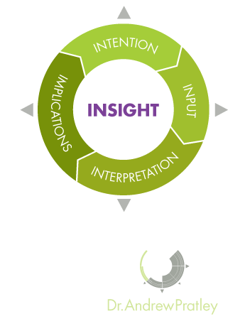
Smarter Data
The Smarter Data model is a structured way to think about solving problems. The model is useful for working through novel problems as each step informs the next, including the implications of the first round informing the intentions of the second round.
Intentions - This is what you want to achieve. A good intention is clear and links to one of the three types of problems.
Inputs - This is the data set needed for the intention. This may either be data you already have access to, or data that you need to collect.
Interpretation - This is the statistical test or visualisation (graph) you'll run to analyse the data from the input. This will usually be either (i) calculating probability (ii) testing for differences or (iii) measuring a relationship.
Implications - This is the conclusion you draw for the business. The implications often requires further analysis or investigation.
The video above is a quick overview of the four components of the Smarter Data model. Intention, Inputs, Interpretation and Implications. The Smarter Data model works both both looking at the item before and the item after the current point of focus.
Questions you are interested in
There are five categories of questions that business leaders want to know about. These are (i) sales (ii) pricing (iii) products (iv) leadership (v) strategy. Within each of these categories it is possible to ask probability, difference and relationship questions. I present a matrix of the most common problems business leaders ask about below.

In the below video, I look at the most common question leaders have - how to double or triple your sales. Doubling or tripling sales is a very large problem to deal with by itself. I discuss how by breaking down the how to increase sales into as (i) probability (ii) differences and (iii) relationships problems how you can use small questions to increase your sales.
In the video below I discuss the topic leaders next want to know about - how to cut costs. I discuss how you can look at questions surrounding (i) probability (ii) differences and (iii) relationships to cut costs in your business. I discuss how you won't always be able to cut costs in one step, but by adopting the right mindset, you will be able to cut costs significantly.
An overview of the three types of problems

Broadly speaking there are three types of data problems. There are problems that involve counting the number of outcomes (probability). There are problems that involve making a decision between two different situations (differences). There are also problems that involve how two or more variables relate to each other (relationships).
Probability - When you're trying to assess how likely an outcome is compared to an expectation, probability is usually the right approach. The classic probability problem involves drawing coloured balls from a bag, or the chance of rolling a certain set of faces on dies. To solve a probability problem you need to be able to calculate the chance of possible outcomes and ensure these equal to one.
The most useful application of probability is the binomial distribution. This is the distribution used when there are only two possible outcomes (a sale or no sale), the chance of success is constant (always 20% chance of a sale), the number of trails is fixed (30 phone calls per day), and the result of one trial doesn't influence the next trial (just because one person buys doesn't influence the next person).
Differences - When you have two (or more) possible approaches testing to see if there is a difference is usually the right approach. Testing differences asks the question whether the mean (average) of one data set is far enough away from the mean of another data set to state they are different. To run a test of differences you'll need to set a level to draw this conclusion (use alpha = 0.05).
The most useful application of differences is the t-test. This is the test of whether the distribution of one average is different to another distribution of an average. To form the distribution of these averages individual data is collected. These distributions are called sampling distributions (of the mean) and are different to distributions of individual data as they use the standard error instead of the standard deviation. The standard error is result of the standard deviation divided by the square root of the sample size (n). To use a t-test you'll need samples of 30 or more to meet normality requirements. An example of testing differences might be to assess whether a change in the layout of the shop results in increased sales.
Relationships - When you have multiple measures on one item you can determine if there is a relationship. When assessing relationships you need to have a data set which links different measures across individuals, locations or time. A relationship doesn't necessarily imply causation, it simply shows correlation. Causation (A caused B) is surprisingly difficult to 'prove'.
The most useful application of relationships is (simple) linear regression. Simple linear regression is the measure of the strength of a linear (straight line) relationship between two variables or measures. This is usually plotted on a graph of a series of x-y points with the line of best fit determined by mathematics. There are number of ways to interpret simple linear regression models. The two values of most interest are the r-squared value and the coefficient of the slope. The r-squared value tells you how much of the variation in y is predicted by x. The coefficient of the slope tells you for a one unit increase in x what the change in y will be. E.g you might develop a simple linear regression model based o the amount of revenue of an event and post event online sales. If there was a strong linear trend with r-squared = 0.8 then we could 80% of the online sales are determined by the revenue of the event. The other 20% could come from online advertising or other factors. If the coefficient of the slope was 0.3 then we could conclude that on average for each dollar spent at the event $0.3 dollars will be spent on the post event online sales.
The video above is short overview of the three types of problems that can be solved with statistics and identifies the key features and an example of each. The three types of problems are: (i) probability (ii) testing differences and (iii) relationships.
Data checklist
The two things you must do for all your questions is ensure your data is (i) verified and correct (ii) Is your range appropriate. In the video below I explore these criteria as well as what your data needs to look like to ask either a probability, difference or relationship question.
Examples of the three types of problems dealing with sales questions
In the video below I discuss how to assess the difference between two sales models by comparing the revenue between commission and non-commission based sales models. Using the the Smarter Data model I show you how to systematically step through this problem and apply the steps to any differences question. I discuss the importance of (i)having each group be randomly selected (ii) Ensuring each sample size is at least 30 and (iii) thinking through how to interpret data properly.
In the video below I use the Smarter Data model to examine whether additional sales staff increase profits. I discuss how to interpret your graphs to understand your data, and what statistical tricks you can use to smooth your data.