
Introduction
This webpage provides additional resources, links and content for the 2024 Risk Management Insitute of Australia conference talk – Transforming your Organisation with Key Risk Indicators. I appreciate that you’ve come here to learn more - if anything isn’t clear you can send me an email directly at andrew@drandrewpratley.com
The slide deck is here. You can watch a recording of the audio with the slide deck or just the audio. Supporting notes are below.
In the talk I mentioned that I had looked for one story to weave through the narrative of key risk indicators and that I couldn't find any that worked - because I couldn't find examples of key risk indicators. One of the examples I looked into is smoking. I'd argue that in the past century the biggest single risk we're aware of for an individual is smoking. It's still the largest cause of preventable death in Australia at ~20,000 people (~13% of deaths). This is a staggering number of preventable deaths. Smoking has a long and varied history, but it can be traced back to 5000 BC in one way or another.
In the talk, I presented a number of scientific discoveries and their dates of publication. Whether Gilbert found the earth's magnetic field in 1600, Mendeleev formed the period table in 1869, or Einstein discovered special relativity in 1905, it's clear that the capability to understand and write about the world has been present for centuries. The question I pose for your consideration is when do you think the link between smoking and death (by cancer) was discovered?
To understand this answer is to understand quantitative risk.
The only way science could identify that smoking caused cancer was for life expectancy to increase to the point that smoking could be identified as a cause of death. Prior to this people were dying of disease, famine or war at an age such that smoking was not identified as a cause of death. The first study was published in 1929. I haven't researched the changes in the chemical composition of cigarettes, but it seems unlikely the reason for the finding was a change in composition; rather, we started to live long enough to see people with the symptoms develop to the point where they were not edge cases. I'm reasonably confident that once we were able to find the earth's magnetic field, we would have had the knowledge to find the link between smoking and cancer if we'd looked. The challenge of quantification is not to measure what's easy and obvious; it's to measure what's difficult and opaque.
The story of smoking does, in some way, represent the story of key risk indicators. We measure what's easy and obvious, not what is difficult and opaque. For all the time, effort and money, there does not seem to be a single key risk indicator for smoking. This sentence in and of itself is astonishing.
There's an enormous amount of money being put into controls once people start smoking; by then it's too late. An interesting data point is that:
"Almost no one starts smoking after age 25. Nearly 9 out of 10 smokers started smoking by age 18, and 99% started by age 26. Progression from occasional to daily smoking almost always occurs by age 26." - Source
A brief and convoluted history of key risk indicators
There's at least a master's thesis in trying to track the various threads of what key risk indicators have meant over the past two decades. The supporting notes to my talk at the 2024 Risk Management Institute of Australasia does not attempt capture the complexity and nuance of this history.
There's an often-misquoted statement about history: 'Those who fail to learn from the past are doomed to repeat it'. The actual quote is 'Those who cannot remember the past are condemned to repeat it.' I think the incorrect version is more adept for risk indicators.
The history of key risk indicators in the literature, and by extension with practitioners is one of redefinition, confusion and misunderstanding. Tracing the lines of these changes, leads us to understand how we have arrived with so many competing phrases and how we might work towards a clear, simple and agreed-upon language. By having a small number of agreed-upon terms, the risk profession will be able to provide better advice to organisations.
Where it all went wrong
In 2004 one of the first articles I came across when researching key risk indicators was published by three staff from Capital One (a US bank - amazingly still in business) in the Special Edition of The RMA Journal titled Operational Risk. Who would have guessed the risk was associated with trying to implement these convoluted and incoherent ideas? The article starts by stating:
"Leading risk indicators with good predictive capabilities are critical to the successful management of enterprise risk. This article describes how a process that incorporates some Six Sigma methods for developing and using key risk indicators was used at Capital One."
Not only are we already talking about "leading" risk indicators, Six Sigma has been dragged into the conversation. My recollection of this period was that there wasn't an organisation that wasn't trying to implement some form of Six Sigma or Lean or both at great cost and often with limited benefit. Having now outlined the approach the authors make the following assertion:
"Key risk indicators encompass different types of metrics. For the purposes of this article, KRIs are divided into four different categories: coincident indicators, causal indicators, control effectiveness indicators, and volume indicators."
Let's just take a moment to consider that it's not enough to include Six Sigma; there are now suddenly four types of key risk indicators. It's 2004. Imagine what the author's might have come up with had the been able to include machine learning and AI? I can't imagine how many more types of key risk indicators they'd need. You might wonder what the four types of indicators are.
"Coincident indicators can be thought of as a proxy measure of a loss event and can include
internal error metrics or near misses. An example of a coincident indicator in a payment processing operation may be the number of misapplied payments identified through internal quality assurance sampling.
Causal indicators are metrics that are aligned with root causes of the risk event, such as system down time or number of late purchase orders.
Control effectiveness indicators provide ongoing monitoring of the performance of controls. Measures may include control effectiveness, such as percent of supplier base using encrypted data transfer, or bypassed controls, such as dollars spent with nonapproved suppliers.
Volume indicators (sometimes called inherent risk indicators) frequently are tracked as key performance indicators; however, they also can serve as a KRI. As volume indicators (e.g., number of online account applications) change, they can increase the likelihood and/or impact of an associated risk event, such as fraud losses. Volume indicators are often associated with multiple risk types in a process or business unit"
Key risk indicators are measures that capture a loss, they're the root cause of an event, they measure control effectiveness, and finally they're also key performance indicators. If you want, there's a six-step process that begins with assessing seven questions with four metrics and a five-point scale which you average the scores over. After this there are more tables to complete, regression plots to develop and as a bonus, you produce control charts. The risk they choose to do this for was ‘Customer contact not completed in an accurate or professional manner’. Seems unnecessary.
The authors conclude by saying:
"While the potential of key risk indicators has been widely accepted for some time, we were not aware of a structured approach to developing and applying key risk indicators when we first started work on our approach. Drawing from the Six Sigma tool set, we have developed it and tested it with encouraging results. While difficult issues remain—such as reporting on disparate KRIs for senior management—we believe applying our basic six-step approach will often lead to more effective key risk indicators and consequently stronger risk management."
Before we can begin to understand the history of key risk indicators, we first need to understand key performance indicators. Key performance indicators were initially developed as a way to inform on performance, hence the word indicators. This is partially where the concept of dashboards came from. Given this information is meant to guide you, you'd want to be able to look at various measures throughout the period of interest. There is an argument to keep key performance indicators in their original form and include key result indicators as a measure of how you have done as David Parmenter argued in his book - Key performance indicators: developing, implementing, and using winning KPIs.
Key performance indicators are generally used today to describe an outcome. We talk about 'achieving' key performance indicators. The change of interpretation is important. Key risk indicators became a replacement for key performance indicators as definitions changed over time.
All history is subjective, and by necessity excludes more than it includes. Between 2000-2010 there were several overlapping narratives with key risk indicators, that are hard to discern. I've chosen to identify, what I believe is a reasonable and simple interpretation based on the literature, talking with experts and my own (limited) experience. I've identified three distinct ideas.
1. Key risk indicators overlapping with key performance indicators
Knowing what key performance indicators used to be guides the early version of key risk indicators. The first iteration of key risk indicators had a lot of overlap with key performance indicators. Whilst it's never stated, my guess is that as performance indicators started to become outcomes, there was a need for information before the outcome. In 2006 Davies et al. wrote:
"The number of customer complaints is an example of a risk indicator. As customer complaints increase, the probability that there are some underlying and potentially systemic mistakes and errors of judgement being made is likely to rise."
Back in 2006, I would have though customer complaints is a performance indicator (in the original meaning). I say this as it's reasonable to imagine a manager saying - we're performing poorly if complaints exceed a certain value. In the current interpretation of performance indicators being outcomes, customer complaints could still be seen as a performance indicator (albeit less useful) as this is an outcome that could be measured. The problem with using customer complaints as a performance measure is that there would be few circumstances where this would not cause additional problems.
Once it's made clear that the expectation is to reduce customer complaints, you're going to need to change the way you run a service business due to the changes we've seen in society in the last decade due to social media, online reviews and lockdowns. As a side note, the most vexing problem with complaints is not the quantum but their nature. Most are trivial disagreements about outcomes. Complaints about process are much more concerning. I've complained to a few organisations recently where it is apparent these two types of complaints are not separated.
In the same article the Davis et al. state that:
“KRIs (or risk indicators in general) have one very specific quality that no other operational risk management or measurement tool offers: quasi real-time exposure information."
'Quasi real-time exposure' doesn't sound like there is sufficient time to act on the information. The overlap and confusion about what a risk indicator is and what a performance indicator is led to the second iteration of the term key risk indicator.
2. Key risk indicators coming before key performance indicators, but these concepts being linked
The second iteration of key risk indicators separated them from key performance indicators by defining that a risk indicator occurs before a performance indicator. This change improved the initial overlap and confusion. In 2010 Beasley et al. wrote:
"Despite the increased focus placed on ERM (Enterprise Risk Management), firms tend to concentrate on key performance indicators (KPIs) which are mostly ex post information sources, based off historical data, which may do little to assess future risks. By contrast, key risk indicators (KRIs) begin with the premise of a future view about risk and metrics are developed by executive leadership as part of a risk management paradigm."
This is the era of the look backward to find your key risk indicators. In their article Beasley et al. (2010) state what has become the generally accepted approach.
"To develop a KRI, a firm must first find a current or historical event that has impacted the organization. The firm must then work backwards to find the intermediate and root causes of the event."
This is another point where the authors offer a well-meaning but intellectually weak position. The example provided is of a grocery store that loses customers when there is an increase in the oil price. Therefore, they conclude oil price is a key risk indicator. When oil goes above a certain price, the store should cut costs to mitigate losing revenue. This example, like many in the literature is convoluted and unclear. If the store could cut costs, why would they wait to do this until the oil price rises? How does a store cut costs? Do they hire fewer staff to offset lower customer spend? How high are salaries in this grocery store?
The era of separating risk indicators and performance indicators was the maturation of the idea. This separation led to the linking we now see. I argue that the change we need to make now is what should have happened as the next iteration of risk indicators. The change required was to define how long before the event is required for a risk indicator to be relevant. Any risk indicator that doesn't provide sufficient time to act on the information is not, in my opinion, a risk indicator. This definition is simple, clear and straightforward.
3. Introducing the terms lead and lag to risk and performance indicators
Instead of defining the duration of time required for a risk indicator the risk profession instead chose to confuse the situation by adopting the terminology lead and lag indicators. This language has become more pervasive in the last decade as the discussion of key risk indicators has increased among practitioners. Cheung et al. (2020) provide one of many examples with the following:
"In construction, safety leading indicators measure safety management processes and practices of firms and projects.
They provide early signals of situations that might increase levels of risk or lead to adverse safety outcomes.
Therefore, leading indicators can prompt proactive measures in response to the current state in order to address the deficiencies or further develop the safety management system."
This change has resulted in multiple terms. There are, in theory, now six terms to consider. Lead risk indicators, risk indicators, lag risk indicators, lead performance indicators, performance indicators, and, of course, lag performance indicators. There were two foreseeable outcomes from this change, the first being that with more terms and no more definitions, there was more overlap and confusion. If you think back to the problems of when risk indicators and performance indicators overlapped, this is even worse. The second outcome was that each person chose their own subset from the six possible terms. You could be agreeing with someone but using completely different terminology.
References
Beasley, M. S., Branson, B. C., & Hancock, B. V. (2010). Developing key risk indicators to strengthen enterprise risk management. ERM Initiative at North Carolina State University and the Committee of Sponsoring Organizations of the Treadway Commission, Raleigh, NC. Website
Cheung, C., Xu, J., Manu, P., Ejohwomu, O., & Freitas, A. (2020, September). Implementing safety leading indicators in construction: Insights on relative importance of indicators. CIB.
Website
Davies, J., Finlay, M., McLenaghen, T., & Wilson, D. (2006). Key risk indicators–their role in operational risk management and measurement. ARM and RiskBusiness International, Prague, 1-32.
Website
Do we need lead and lag in the lexicon?
Back in 2007 Manuele reviewed the early use of leading and lagging and concluded that:
"This author’s premise is that using the terms leading and lagging indicators does not add value to the practice of safety.
Since the SH&E professional’s function is to give counsel to achieve acceptable risk levels, it is not advantageous to confound discussions of risk with vague, intermediary terms."
The current terminology, albeit hard to make generalisations about when there are no agreed-upon definitions is that a lead key risk indicator, is just a risk indicator by my definition (one with sufficient time to act upon the information).
What do we make of lagging risk indicators and leading performance indicators? These are actions taken to reduce or mitigate the adverse outcomes that are anticipated. I would argue these are forms of controls. Herbert (2009) wrote about leading performance indicators; the first two sentences of the abstract are:
"This paper provides operators with a methodology for selecting and / or validating the leading Process Safety Key Performance Indicators related to the Plant Design for facilities or platforms.
The importance of Leading Process Safety KPIs is to provide assurance of barriers, also known as Risk Control Systems (RCSs) under HSG 254, ‘Developing process safety indicators’ (HSE, 2006) ahead of any incident."
A leading key performance indicator is a risk control in the words of Herbert (2009). We could therefore generalise to say anything we do between a risk indicator and performance indicator is a form of risk control.
To develop risk indicators, we need to define what they are not. They're not controls in any way shape or form. When I look at the examples presented online or discussions I believe most of what I hear described as risk indicators is a form of control. Controls are important; they are the primary way in which risk is managed either though design or through use.
This lead us to the model I propose where:
Key risk indicators are those with sufficient time to act on the information to avoid or mitigate the risk.
Key control indicators are those with insufficient time to act on the information to avoid or mitigate the risk. We use key control indicators to manage risk once we're aware.

Figure 01: A visual representation of risk indicators, control measures and performance outcomes and how these three distinct periods have no overlap.
References
Manuele, F. A. (2009). Leading & lagging indicators. Professional Safety, 54(12), 28-33. WebsiteHerbert, I. (2009, September). A Proven Methodology to Select and Validate Leading Process Safety Key Performance Indicators (KPIs). In SPE Offshore Europe Conference and Exhibition (pp. SPE-124508). SPE. Website (NOTE: Abstract only)
A quick diversion to talk about sport
As mentioned previously key performance indicators are generally outcomes. If we trace the history, we'll see that they were at one point intended for use in real-time, but have now become understood to mean outcomes. Over the course of a period (often a year) a predefined outcome is set. At the end of the period, you can determine whether you met or failed the expectation. I use the term outcome as you can't change the result. If we were to use sport as an analogy the outcome is the final score. You can't have a leading outcome or a lagging outcome, you have the outcome at the end of the defined period. You can go back and argue specific details that occurred, but the result on the scoreboard at the end of time allocated is the final score.
Continuing with the sports analogy, the current discussion of key risk indicators as information that happens before the outcome would relate to events that happen on the field during the game. This highlights the incorrect assumption of how key risk indicators are discussed, and why they have failed to produce meaningful results for organisations. Professional sport requires teams to be selected ahead of the game, and with a few exceptions, you can't change the composition of the players (noting concussion rules have changed this recently). Using the definition of a key risk indicator being enough time to act on the information, anything that happens during the game doesn't give you time to act on the information because the game is already being played. A key risk indicator is information available to you before the game begins, when you can still change the strategy, select different players or practise specific tactics. Key risk indicators are thought of as 'we should look over there' type of information as opposed to 'we should change this now' information.
If you accept that key performance indicators are outcomes, then key risk indicators would be inputs, or predictions. Unlike outcomes, which are defined and easy to assess, inputs or predictions are harder to specify, which is why you often want a handful. In the case of the sports analogy, the key risk indicators would be around the injury risk of players, their ability to react to changes in the game, and the expectations of how the other team will play. Knowing this information will help you prepare as effectively as you can for the game.
What happens during the game when the team is not performing? You're making interventions. You're reacting in 'real-time'. In risk this is often referred to control indicators. I prefer control measures. Based on the data available you would change which control measures you use and how you use them. If the team is behind but still close and it's early in the game, you might choose to make small changes. Contrast this with the team being a long way behind with limited time left you might make more substantive changes (substituting players, a different tactic etc). Being behind on the score is not, and cannot be, a risk indicator because it's clear, precise information. You're also not in a position to do much about this. You can't ask to stop the game and bring in new players, or to go back in time and change the coaching approach.
I don't believe you can have 'leading' and 'lagging' control measures. In the process of trying to define these terms, we lose sight of the fact that we're now in a position where we have insufficient time to avoid the risk, and the best we can do now is manage the risk through interventions.
How do KPIs become KRIs?
There are few, if any, instances where we have one single outcome. Outcomes become inputs due to time moving in one direction. Returning to the analogy of sport, we can see how the result of one game is an outcome in and of itself. That outcome could also be seen as an input if we define the key performance indicator as the final position at the end of the regular season. For most teams winning any individual game matters a lot less than whether they make the final series.
The difficulty of using inputs, interventions, and outcomes is not defining the exact point at which they begin and end; it's their interconnected nature. One of the difficulties is agreeing on the outcome that matters, working backward from this, and not changing this throughout the process.
If you consider the game the outcome then what happens during the game are interventions. If you consider the end of the season the outcome then what happens during the game could be considered inputs or predictions. If we take the specific example of a player sustaining an injury, we can see how the decision varies about what to do depending on where the team is in the season. Early on they'll probably be taken off and given time to recover - this could be seen as a risk indicator. As you move later into the season, they're more likely to stay on, as each game becomes more important - this is now a control measure. If a player is injured in the final, they'll rarely remove them as the outcome is too close. Having the other players protect the player, limiting their exposure or providing painkillers is a control measure because you have insufficient time to do anything meaningful before the outcome. Why remove a player with 20 minutes left in the season if it's a six-week recovery?
It's possible to see the world through different time horizons simultaneously and thus have to trade off these time horizons to make the right decision. In the sports analogy a coach will often look at what's happening on the field both through the lens of how the game is going (control measures) as well as how the team will perform over the season (risk indicators).
Most organisations have a clear idea of the expected outcomes they seek to achieve. When these are reviewed, the wording is usually a bit vague, but the sentiment is in the right direction. At a department or function level, it's often clearer. Finance might set an outcome around one or more balance sheet ratios, human resources might set an outcome around employee turnover, and manufacturing might set an outcome around machine utilisation.
How do I distinguish a risk indicator and control indicator?
There are five ways in which risk indicators and control indicators can be separated. The first has already been addressed in the definition of a risk indicator - sufficient time to act.
Table 01: Risk indicators and control indicators compared by action, quantification and location.

One of the simplest ways to distinguish between a risk indicator and a control indicator is how you react to the information. Control indicators result in action, while risk indicators are information that you watch. This is partly due to their temporal nature, but it's also because they're harder to quantify. As risk indicators are hard to quantify you can't say - 'oh this is bad we must do something', where as with a control indicator you could.
From a statistical point of view, your risk indicators should be independent - this means each provides unique information. We're after unique information because it develops a more robust and valid approach to understanding what might happen in the future. I use the term directionality to describe what you're looking for. Control indicators tend to be correlated because these are all related to each other. We're not looking to find new information; we're looking to confirm what we see. When we look at variables, these are generally correlated by default. It's hard, both statistically and through thinking, to find independent variables. As an example, try and find three independent variables to assess the quality of your relationship.
Control indicators are usually within the business - these are variables that usually discussed or possibly already reported. Your staff are going to know the control indicators because they use these already. Risk indicators are usually outside the business. Risk indicators may involve your staff, but these are rarely related to their job description.
Additional resources for data collection and analysis
The following section has a variety of introductory information on how to think about data and analytics for commercial purposes.
Finding your data
Your data is can usually be found in (i) your systems (ii) your customers or (iii) your staff. In the video below I describe how when we look at our systems we’re often looking back into our history., when we speak to our customers we learn about the present, but when we work with our internal experts (staff) that’s where the real opportunity is.
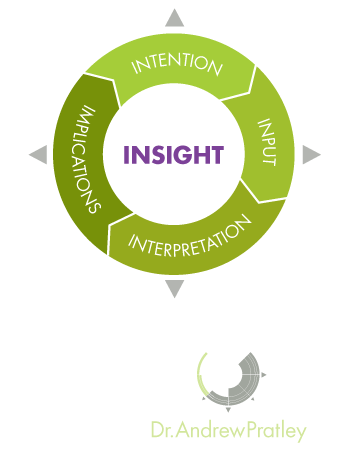
Smarter Data
The Smarter Data model is a structured way to think about solving problems. The model is useful for working through novel problems as each step informs the next, including the implications of the first round informing the intentions of the second round.
Intentions - This is what you want to achieve. A good intention is clear and links to one of the three types of problems.
Inputs - This is the data set needed for the intention. This may either be data you already have access to, or data that you need to collect.
Interpretation - This is the statistical test or visualisation (graph) you'll run to analyse the data from the input. This will usually be either (i) calculating probability (ii) testing for differences or (iii) measuring a relationship.
Implications - This is the conclusion you draw for the business. The implications often requires further analysis or investigation.
The video above is a quick overview of the four components of the Smarter Data model. Intention, Inputs, Interpretation and Implications. The Smarter Data model works both both looking at the item before and the item after the current point of focus.
How to increase sales and cut costs
In the below video, I look at the most common question leaders have - how to double or triple your sales. Doubling or tripling sales is a very large problem to deal with by itself. I discuss how by breaking down the how to increase sales into as (i) probability (ii) differences and (iii) relationships problems how you can use small questions to increase your sales.
In the video below I discuss the topic leaders next want to know about - how to cut costs. I discuss how you can look at questions surrounding (i) probability (ii) differences and (iii) relationships to cut costs in your business. I discuss how you won't always be able to cut costs in one step, but by adopting the right mindset, you will be able to cut costs significantly.
An overview of the three types of problems

Broadly speaking there are three types of data problems. There are problems that involve counting the number of outcomes (probability). There are problems that involve making a decision between two different situations (differences). There are also problems that involve how two or more variables relate to each other (relationships).
Probability - When you're trying to assess how likely an outcome is compared to an expectation, probability is usually the right approach. The classic probability problem involves drawing coloured balls from a bag, or the chance of rolling a certain set of faces on dies. To solve a probability problem you need to be able to calculate the chance of possible outcomes and ensure these equal to one.
The most useful application of probability is the binomial distribution. This is the distribution used when there are only two possible outcomes (a sale or no sale), the chance of success is constant (always 20% chance of a sale), the number of trails is fixed (30 phone calls per day), and the result of one trial doesn't influence the next trial (just because one person buys doesn't influence the next person).
Differences - When you have two (or more) possible approaches testing to see if there is a difference is usually the right approach. Testing differences asks the question whether the mean (average) of one data set is far enough away from the mean of another data set to state they are different. To run a test of differences you'll need to set a level to draw this conclusion (use alpha = 0.05).
The most useful application of differences is the t-test. This is the test of whether the distribution of one average is different to another distribution of an average. To form the distribution of these averages individual data is collected. These distributions are called sampling distributions (of the mean) and are different to distributions of individual data as they use the standard error instead of the standard deviation. The standard error is result of the standard deviation divided by the square root of the sample size (n). To use a t-test you'll need samples of 30 or more to meet normality requirements. An example of testing differences might be to assess whether a change in the layout of the shop results in increased sales.
Relationships - When you have multiple measures on one item you can determine if there is a relationship. When assessing relationships you need to have a data set which links different measures across individuals, locations or time. A relationship doesn't necessarily imply causation, it simply shows correlation. Causation (A caused B) is surprisingly difficult to 'prove'.
The most useful application of relationships is (simple) linear regression. Simple linear regression is the measure of the strength of a linear (straight line) relationship between two variables or measures. This is usually plotted on a graph of a series of x-y points with the line of best fit determined by mathematics. There are number of ways to interpret simple linear regression models. The two values of most interest are the r-squared value and the coefficient of the slope. The r-squared value tells you how much of the variation in y is predicted by x. The coefficient of the slope tells you for a one unit increase in x what the change in y will be. E.g you might develop a simple linear regression model based o the amount of revenue of an event and post event online sales. If there was a strong linear trend with r-squared = 0.8 then we could 80% of the online sales are determined by the revenue of the event. The other 20% could come from online advertising or other factors. If the coefficient of the slope was 0.3 then we could conclude that on average for each dollar spent at the event $0.3 dollars will be spent on the post event online sales.
The video above is short overview of the three types of problems that can be solved with statistics and identifies the key features and an example of each. The three types of problems are: (i) probability (ii) testing differences and (iii) relationships.
Data checklist
The two things you must do for all your questions is ensure your data is (i) verified and correct (ii) Is your range appropriate. In the video below I explore these criteria as well as what your data needs to look like to ask either a probability, difference or relationship question.
Examples of the three types of problems dealing with sales questions
In the video below I discuss how to assess the chance of success per sales using probability. I discuss what the distribution of successful sales calls looks like and the implications this can have for your business.
In the video below I discuss how to assess the difference between two sales models by comparing the revenue between commission and non-commission based sales models. Using the the Smarter Data model I show you how to systematically step through this problem and apply the steps to any differences question. I discuss the importance of (i)having each group be randomly selected (ii) Ensuring each sample size is at least 30 and (iii) thinking through how to interpret data properly.
In the video below I use the Smarter Data model to examine whether additional sales staff increase profits. I discuss how to interpret your graphs to understand your data, and what statistical tricks you can use to smooth your data.